design
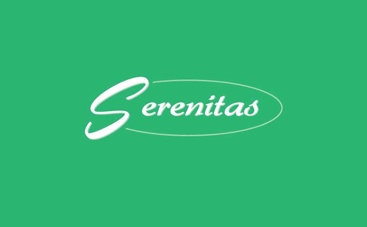
Serenitas
This logo was developed for a client whose brand, Serenitas, required a simple and natural visual identity. They specifically requested a design that reflected these qualities. I selected [mention the font name, e.g., Lato, Open Sans] as the primary typeface…
Jan 2015